Today’s chosen theme: Mastering Visual Order in Design. Step into a thoughtful exploration of hierarchy, rhythm, and clarity—practical methods and stories that help your interfaces read in a heartbeat. Subscribe and share your toughest layout challenges; we’ll tackle them together.
The Psychology Behind Visual Order
Proximity, similarity, and continuity guide scanning more than we admit. Group related controls tightly, style similar items consistently, and align flows logically to reduce mental friction. Tell us where Gestalt principles rescued a cluttered screen in your work.
A disciplined type scale transforms walls of text into a guided story. Establish roles for headings, subheads, and body copy, then stick to them. Post your favorite type scale and why it clarifies decisions for your team.
Contrast should whisper, not shout. Use bolder weights and generous spacing to elevate the primary action while keeping secondary options visible. Which subtle contrast tweak most improved your conversion flow? Share your before and after.
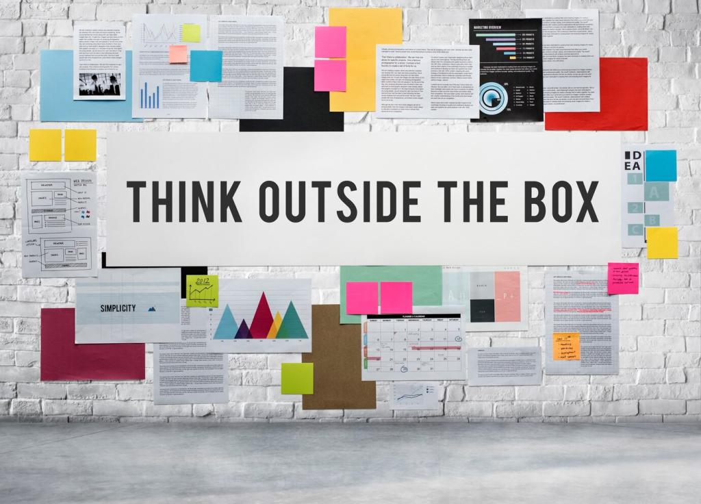
Every screen deserves one clear priority. Remove competing highlights, reduce decorative noise, and allow whitespace to amplify intent. Tell us the story of the moment a single focal point cut support tickets in half.
Grid Systems and Alignment That Calm Chaos
Choosing the Right Grid for the Job
A simple column grid handles most marketing layouts, while modular grids shine in dashboards. Start with constraints, then scale responsibly. Comment with your go-to grid and how it changed collaboration with engineering.
When text sits on a shared baseline, paragraphs breathe together and scanning becomes effortless. Align line heights and spacing to keep rhythm steady. Have you tried baseline mapping across breakpoints? Share what worked.
Left edges, button rows, and form fields that align communicate professionalism. Micro-adjust offsets that create visual rattling. Tell us about a misalignment you fixed that instantly made a screen feel premium.
Cluster related inputs, labels, and help text tightly; give neighboring groups generous separation. Users should identify clusters at a glance. Share a screenshot where tightening internal spacing clarified a complex form.
Proximity, Grouping, and Whitespace in Action
Whitespace frames priorities and improves comprehension. Resist filling every corner; let margins and padding guide attention. Comment with a time when removing one decorative element created clarity you didn’t expect.
Proximity, Grouping, and Whitespace in Action
Color and Contrast That Organize Information
A Palette with Purpose
Assign semantic roles to colors: primary action, secondary action, information, warning, success. Keep accents rare to preserve meaning. Share your token set and how it enforces visual order across products.
Contrast for Readability and Hierarchy
Adequate contrast makes text legible and hierarchy reliable under different lighting conditions. Test dark modes and color blindness simulations early. Tell us how contrast testing changed your design decisions.
Using Color Sparingly to Direct Flow
Limit bright hues to the most important elements. Neutral surfaces reduce cognitive noise and let content lead. Comment with a case where removing a color improved task completion rates significantly.
Motion and Interaction That Reinforce Order
Animate elements from their origin to their destination to show continuity. Keep durations consistent, gentle, and purposeful. Share your favorite transition that made complex navigation feel effortless.
Motion and Interaction That Reinforce Order
Subtle hover states, pressed feedback, and progress indicators guide focus. Use them to confirm intent and reveal next steps. Which microinteraction most reduced errors in your latest release? Tell us below.
Visual Order in Data Visualization
Line for trends, bar for comparisons, position over color for precise reading. Prioritize channels that users interpret fastest. Share a dashboard where a simple encoding swap unlocked insight for stakeholders.
Visual Order in Data Visualization
Use annotations, subtle highlights, and consistent scales to guide reading. Avoid chartjunk that distracts from the story. Post an example where removing decoration clarified a critical insight instantly.