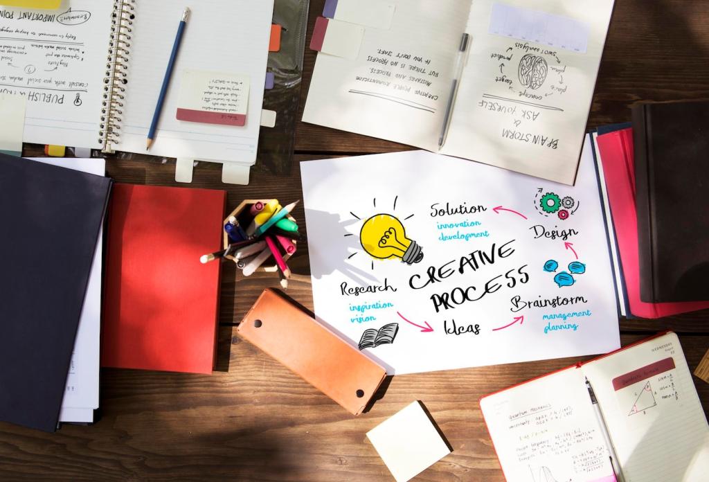
Techniques in Visual Order for Artists and Designers
Chosen theme: Techniques in Visual Order for Artists and Designers. Welcome to a brisk, inspiring tour of how to guide attention, structure meaning, and build delightful experiences that feel instantly clear. Let’s shape what viewers see first, next, and last—then invite them deeper. If this resonates, subscribe and tell us where visual order challenges show up in your work.
The Core of Visual Hierarchy
Create focal points that genuinely earn attention through contrast, scale, and placement. A strong focal point answers, at a glance, what matters here and why. Share a recent project where a single change in emphasis transformed comprehension.
The Core of Visual Hierarchy
Eye-tracking consistently reveals scanning patterns, such as F-patterns for dense text and Z-patterns for simpler layouts. Respect habitual scans, then layer secondary paths using anchors and rhythm. Tell us which pattern fits your audience best.
Gestalt Principles that Organize Perception
Proximity as Silent Grammar
Proximity writes relationships without words: items that belong together should live together. A gallery once fixed confusing labels simply by adjusting spacing. Rearrange your elements and note where meaning snaps into place. Tell us what changed.
Similarity and Continuity in Flow
Consistent shapes, weights, or colors build families, while continuity guides motion through lines and implied paths. Use repetition to signal sameness and gentle curves to lead the eye. Which recurring motif anchors your current series?
Figure–Ground and the Power of Space
Clear figure–ground saves viewers from guessing. White space is not empty; it is narrative breath and emphasis. Try a quick before-and-after applying extra space, then share whether your main subject finally “stands up” from the background.
Grids, Alignment, and Rhythmic Structure
A modular grid prevents drift and decision fatigue. Twelve-column layouts, 8-point spacing, and predictable gutters keep elements negotiating fairly. Draft a quick grid for your next page and report how much faster your decisions feel.
Grids, Alignment, and Rhythmic Structure
Align text to a baseline grid to stabilize rhythm across headings, body, and captions. Consistent line height builds comfort and speed. Print a sample, read it aloud, and notice how the cadence supports comprehension. Share your settings.
Contrast Beyond Color
Use value, texture, shape complexity, and whitespace as contrast levers, especially when color is limited or inaccessible. A dark, simple shape in a light, detailed field commands attention. Try three non-color contrasts and share your results.
Scale as Narrative Pacing
Big elements set the stage; small elements whisper details. Moving thoughtfully between scales guides discovery and drama. Prototype a layout with one oversized hero and tiny metadata, then measure how quickly viewers find the main message.
Directional Cues and Micro-Emphasis
Arrows, faces, and motion suggest where to look next. Micro-animations can clarify sequence without shouting. Add a subtle directional cue today and ask a colleague where their eye moved. Report back so we can compare patterns.
Prototyping, Testing, and Iteration for Visual Order
If viewers cannot articulate the purpose within five seconds, hierarchy failed. Blur your design to reveal value structure without details. Try both tests today and share what changed when you rebalanced contrasts or spacing.